


TL;DR:
- A data dashboard is an interactive, single-page tool that consolidates real-time visualizations and KPIs for monitoring and decision-making. It differs from reports by emphasizing at-a-glance insights, limited KPIs, and user interaction through alerts and natural language queries. Building effective dashboards requires focusing on decisions, simplifying metrics, and designing for clarity and mobile use.
Most business professionals look at a data dashboard and think they’re looking at a fancy report. They’re not. A dashboard is a living decision-support tool, not a static document you print and file. The distinction matters because the way you build, design, and use a dashboard either accelerates your decision-making or creates a beautiful mess of charts nobody trusts. This guide breaks down what a data dashboard actually is, which types exist, how to design one that works, and which tools are reshaping the category right now.
Table of Contents
- Key takeaways
- What a data dashboard actually is
- The four dashboard types you need to know
- Dashboard design that actually works
- Modern tools and AI-powered features
- Implementing dashboards for real decision support
- My take on why most dashboards fail
- See your business intelligence clearly with Blue Prysm
- FAQ
Key takeaways
| Point | Details |
|---|---|
| Dashboards are not reports | A data dashboard shows at-a-glance monitoring with alerts and Q&A; reports support deep filtering and exploration. |
| Limit your KPIs ruthlessly | Executive dashboards should display 3 to 5 KPIs; operational views can handle up to 7 before comprehension drops. |
| Design before you build | Understand which decisions your dashboard supports before choosing a single chart type or color. |
| AI is redefining interaction | Modern platforms embed natural language queries so users ask questions and get answers, not just raw visuals. |
| Consolidate data first | Aggregating data before visualization prevents cluttered, misleading interpretations that erode trust. |
What a data dashboard actually is
The term gets thrown around loosely, so let us be precise. A data dashboard is a single-page interactive canvas that consolidates visualizations, metrics, and key performance indicators from multiple data sources into one unified view. Think of it as the instrument panel in a cockpit. Every critical reading is visible at once, and the pilot does not have to flip through pages to know if something is wrong.
What separates a dashboard from a traditional report comes down to intent and interaction. Dashboards show at-a-glance monitoring with Q&A and alerts, while reports support deep slicing and exploration across multiple pages with complex filtering. A dashboard tells you what is happening. A report helps you dig into why.
Here is a quick comparison to make that distinction concrete:
| Feature | Data dashboard | Traditional report |
|---|---|---|
| Layout | Single page | Multi-page |
| Filtering | Limited or none for consumers | Full filtering and slicing |
| Updates | Real-time or near real-time | Scheduled or manual |
| Natural language Q&A | Supported in modern platforms | Rarely supported |
| Alerts | Yes, user-configurable | No |
| Primary use | Monitoring and quick decisions | Deep analysis and investigation |
Key features you should expect from any modern data dashboard include:
- Tiles: Individual visualization blocks pulled from one or more reports or semantic models
- Real-time updates: Tiles refresh as underlying data changes, so you are always reading current numbers
- Natural language Q&A: Users can type questions in plain English and get instant chart or table responses
- Configurable alerts: Set thresholds on specific metrics and get notified when they are crossed
Dashboard use cases span every function. A sales team monitors pipeline velocity and win rates. A CFO watches cash flow, burn rate, and receivables aging. A supply chain manager tracks on-time delivery and inventory levels. The multi-scale planning capability of interactive dashboards even extends to government agencies, where the US Forest Service uses them to connect national resource assessments to county-level planning decisions.
The four dashboard types you need to know
Not all business dashboards serve the same purpose. Picking the wrong type is like installing a speedometer where the fuel gauge should be. Here are the four core types and when each one applies.
Operational dashboards focus on what is happening right now. They display real-time data analytics for frontline teams who need to act fast. Think customer support ticket queues, live server uptime, or hourly sales figures during a product launch. KPIs on operational dashboards refresh frequently, often by the minute.
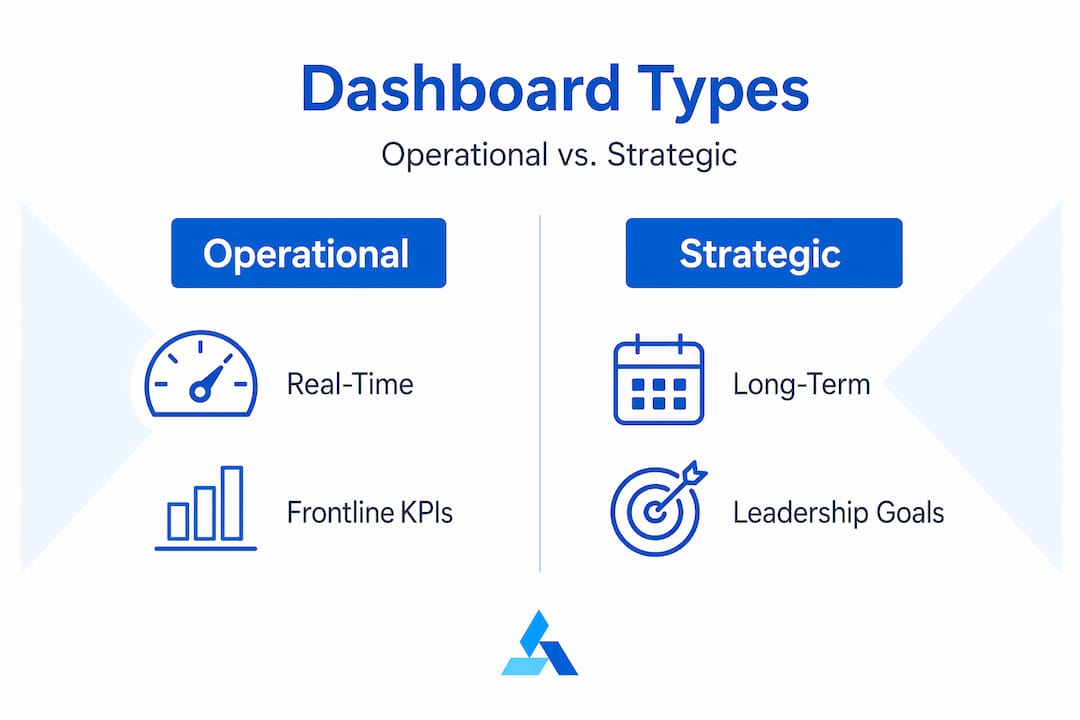
Strategic dashboards serve executives and senior leaders who care about progress against long-term goals. These are the business intelligence dashboard views that answer questions like: Are we on track to hit annual revenue targets? How is market share trending? KPIs are fewer and broader, typically monthly or quarterly rollups.

Analytical dashboards go deeper. They are built for data analysts who need to explore trends, test hypotheses, and find root causes. These dashboards often include drill-down paths, comparison charts, and historical trend lines. The audience here is comfortable with complexity.
Tactical dashboards sit between strategic and operational. They support middle management in tracking department-level KPIs over days or weeks. A marketing manager watching campaign performance across channels is using a tactical dashboard.
- Operational: Real-time, frontline, action-oriented. Refresh rate: minutes.
- Strategic: Long-term trends, executive audience. Refresh rate: weekly to monthly.
- Analytical: Deep exploration, data analysts. Refresh rate: variable, historical.
- Tactical: Department performance, middle management. Refresh rate: daily to weekly.
Pro Tip: Before you decide which type to build, write down the three decisions this dashboard needs to support. If you cannot name them, you are not ready to design it yet.
Dashboard design that actually works
Here is an uncomfortable truth about most business dashboards in the wild: they are data dumps dressed up with color. Fifteen charts, twelve filters, and zero clarity about what anyone is supposed to do with any of it. Good design is not about aesthetics. It is an architecture decision that determines whether your dashboard gets used or ignored.
Follow these principles to build dashboards that people trust and return to:
- Limit your KPIs. Excessive metrics cause comprehension to drop. Keep executive views to 3 to 5 KPIs. Operational dashboards can stretch to 7. Beyond that, users start skipping metrics entirely, which defeats the purpose.
- Respect visual hierarchy. The most important metric belongs in the top-left position. Eye-tracking research confirms that users scan screens in an F-pattern, so your critical number needs to be where the eye lands first.
- Use progressive disclosure. Surface the headline number on the dashboard tile. Let users click through to the underlying report for the full story. Linked reports beneath dashboard tiles serve users who need flexible filtering without cluttering the primary view.
- Pick charts that answer specific questions. Bar charts compare categories. Line charts show trends over time. Scatter plots reveal correlations. Using a pie chart to show seven segments is not a design choice. It is a communication failure.
- Eliminate visual clutter deliberately. Remove 3D effects, unnecessary borders, and decorative elements that consume attention without adding information. Every pixel that does not communicate something should be white space.
- Design for mobile from the start. More executives review dashboards on phones than most designers plan for. If your layout collapses on a small screen, your insights do not reach the people who need them.
Pro Tip: Treat dashboard design as a research exercise first. Interview the actual users before you open your data dashboard software. Ask them: What decision do you make every morning? What number would change your behavior today? Build for those answers.
Modern tools and AI-powered features
The data dashboard software market has shifted fast. The tools available in 2026 look nothing like the static chart builders from five years ago. Here is where the category stands.
Power BI remains the dominant platform for enterprise business dashboards. Its architecture separates dashboards from reports in a meaningful way: dashboards are single-page canvases composed of tiles pulled from one or more underlying reports, and they support Q&A natural language queries and configurable alerts. Reports handle the heavy filtering. Dashboards handle the monitoring.
Google Sheets with Gemini has made rapid dashboard creation accessible to teams without dedicated BI specialists. Google’s three-step workflow aggregates data across files, computes summary metrics like sales, expenses, and ROI, then generates visual comparisons and campaign charts for executive-ready storytelling in under five minutes.
The most significant shift, though, is the embedding of conversational AI directly into the dashboard interface. Paystack’s 2026 redesign is the clearest example: their AI Command Centre lets merchants type questions like “What happened with this transaction?” and receive instant answers as text, tables, or charts. No SQL. No analyst required. Just a question and an answer.
| Platform | Best for | AI features | Mobile-friendly |
|---|---|---|---|
| Power BI | Enterprise BI | Natural language Q&A, anomaly detection | Yes |
| Google Sheets + Gemini | Rapid creation, SMBs | Gemini-assisted summaries and charts | Partial |
| Paystack Command Centre | Fintech operators | Conversational AI, transaction queries | Yes |
| Customizable analytics platforms | Cross-industry | AI-driven briefings, competitor tracking | Yes |
For business professionals who need a customizable analytics dashboard without building one from scratch, AI-powered platforms are closing the gap between Fortune 100 capabilities and SMB budgets fast. Understanding your business intelligence foundation is the prerequisite for choosing the right tool.
Implementing dashboards for real decision support
Building a dashboard that gets used comes down to execution discipline. Most implementations fail not because of bad tools but because teams skip the foundational steps.
- Consolidate your data first. Before a single visualization goes live, aggregate data across sources and structure it cleanly. Raw, disconnected data fed directly into a dashboard produces charts that contradict each other and erode stakeholder trust immediately.
- Define your summary metrics. Calculated fields like revenue per customer, churn rate, and conversion rate tell a cleaner story than raw counts. Decide which derived metrics matter before you build.
- Align every KPI to a decision. Ask yourself: If this number moves, who changes their behavior and how? If you cannot answer that, the metric does not belong on the dashboard.
- Build in a maintenance schedule. Data sources change, business priorities shift, and dashboards go stale. Assign an owner and schedule a quarterly review to remove obsolete metrics and add new ones.
- Present dashboards in context. When sharing a real-time analytics dashboard with stakeholders, walk them through the hierarchy. Show them where to look first, how to drill down, and how to set alerts for the metrics that affect their work directly.
The actionable intelligence guide for SMBs at Blue Prysm covers the data consolidation and metric alignment process in detail if you need a structured framework to work from.
My take on why most dashboards fail
I have seen a lot of dashboard implementations, and the pattern behind the ones that fail is almost always the same. The team spends weeks perfecting the visual design, arguing about color schemes and chart types, and ships something that looks polished but does not answer a single question anyone on the leadership team actually asks.
The problem is that most dashboards are built backward. You start with the data you have, throw it into a tool, and call the output a dashboard. What you should do is start with the decisions your organization makes repeatedly, map the metrics that inform those decisions, and only then touch the design.
In my experience, the most effective dashboards I have seen are almost boring to look at. Three numbers at the top, a trend line, and a drill-down for anyone who wants more. That is it. The teams that use them every day do not care that they look minimal. They care that they can make a call in thirty seconds.
The AI integration trend is genuinely changing user expectations in ways that matter. Once someone can just ask their dashboard a question and get a direct answer, the tolerance for hunting through filters and charts disappears fast. Conversational AI inside dashboards is not a feature. It is a new baseline. If your current tools do not support natural language interaction, your users will find tools that do.
The future of the interactive data visualization category is not more charts. It is fewer charts, smarter context, and answers that arrive before the user has to formulate the question.
— Colin Bowdery
See your business intelligence clearly with Blue Prysm
Most business professionals do not need to build a dashboard from scratch. They need intelligence that is already organized, current, and tied to the decisions they make every day.
Blue Prysm delivers exactly that. The platform aggregates market signals, competitor activity, and performance data into AI-powered briefings designed for business decision-makers who do not have a data team on call. Every briefing is structured around the metrics and trends that actually shift strategy, not raw data noise. If you want to understand how Blue Prysm works and how it compares to building your own analytics stack, the platform walkthrough covers the full picture. For teams ready to compare plan options, Blue Prysm’s pricing is transparent and built for SMB budgets.
FAQ
What is a data dashboard?
A data dashboard is a single-page interactive canvas that consolidates visualizations, KPIs, and metrics from multiple data sources into one unified view. Unlike reports, dashboards support real-time updates, configurable alerts, and natural language Q&A queries.
How is a dashboard different from a report?
Dashboards are built for at-a-glance monitoring and do not support page-level filtering by end users. Reports are multi-page tools designed for deep data exploration with full filtering and slicing capabilities.
How many KPIs should a dashboard display?
Executive dashboards perform best with 3 to 5 KPIs. Operational dashboards can extend to 7. Beyond that, user comprehension drops and critical metrics get skipped.
What makes a data dashboard effective?
Effective dashboards start with a clear understanding of which decisions they support, limit KPIs to reduce cognitive load, place the most critical metric top-left, and provide drill-down paths for users who need deeper context.
Which data dashboard software is best for small businesses?
Google Sheets with Gemini works well for rapid creation with minimal technical overhead. AI-powered platforms like Blue Prysm offer pre-built intelligence structures for SMBs that want strategic insights without building a custom BI stack.
Recommended
- What is business intelligence: the SME owner’s guide – Articles & Blogs
- Data-Driven Strategy Examples for SMEs: Real-World Wins – Blue Prysm – Articles & Blogs
- Master the business decision making process for smarter growth – Articles & Blogs
- Data foundry explained: A guide for smart business leaders – Articles & Blogs