


Every KPI dashboard on earth fits into one of four buckets: executive, operational, tactical, or analytical. Executive dashboards show a small number of strategic numbers to leadership. Operational dashboards track daily activity for frontline teams. Tactical dashboards sit in between, guiding department heads through weekly and monthly decisions. Analytical dashboards let specialists dig into trends and root causes without a fixed layout at all.
This article gives you real examples of each type, organized by department, so you can copy the structure instead of starting from a blank canvas. You’ll get:
- Concrete dashboard examples for marketing, sales, finance, customer service, IT, and operations
- Layout rules for what goes in the top row, the main chart, and the watchlist
- Copyable KPI lists by department, tagged as leading or lagging
- A short walkthrough on turning dashboard numbers into a KPI tree with real owners attached
This piece is written by Colin Bowdery for Blue Prysm, which builds strategy tools for small and midsize businesses, including dashboards that tie directly into a KPI tree rather than sitting as a disconnected chart wall.
Key Takeaways
A KPI dashboard only works when it’s matched to one audience, limited to the KPIs that audience actually needs, and connected to a named owner for every metric shown.
| Point | Details |
|---|---|
| Match the dashboard type to the audience | Executive dashboards need 3 to 5 KPIs; operational and tactical dashboards can run 6 to 10. |
| Pair leading and lagging indicators | Combine a lagging metric like revenue with 2 to 3 leading indicators that predict it. |
| Standardize metric definitions | Assign one owner per metric definition to prevent conflicting numbers across teams. |
| Use a KPI tree for accountability | Break objectives into drivers and owners so a red metric always points to a next step. |
| Consider a strategy-linked platform | Blue Prysm connects dashboard signals to a strategy library and automated briefings for teams that want KPIs tied to owned actions. |
KPI Dashboard Examples and Templates by Audience and Function
Dashboards fail when they try to be everything to everyone. The fix is picking the right type for the right audience, then filling it with the right KPIs. Below are working templates you can rebuild in whatever tool you already use.
Executive dashboards answer one question: are we on track? They stay tight, often just a handful of strategic KPIs, and refresh weekly or monthly rather than in real time.
- Company scorecard. Top row: key financial indicators such as revenue compared to target, gross margin, and cash runway. Main chart: revenue trend over time with a target line overlay. Watchlist: departments trending red. Use case: monthly board update.
- Growth dashboard. Top row: key customer-related metrics like net new customers and churn rate. Main chart: recurring revenue growth displayed by new, expansion, and churned segments. Watchlist: accounts at renewal risk. Use case: quarterly investor or leadership review.
Operational dashboards run hot. They refresh in near real time and serve the people doing the work, not the people reviewing it later.
- Support queue dashboard. Top row: operational metrics such as open tickets and response times. Main chart: ticket volume by hour. Watchlist: escalated tickets with no owner. Use case: support team morning standup.
- Warehouse/fulfillment dashboard. Top row: fulfillment metrics including orders shipped, on-time percentage, and backorder counts. Main chart: units shipped by hour vs. capacity. Watchlist: SKUs out of stock. Use case: shift supervisor floor monitor.
- IT uptime dashboard. Top row: IT performance indicators like system uptime and incident resolution time. Main chart: incident volume by severity over 30 days. Watchlist: unresolved P1 incidents. Use case: on call engineer reference.
Tactical dashboards bridge daily operations and quarterly strategy. Department heads live here.
- Sales pipeline dashboard. Top row: sales pipeline metrics including value and deal size. Main chart: pipeline by stage this quarter vs. last. Watchlist: deals stalled more than 14 days. Use case: weekly sales team review.
- Marketing funnel dashboard. Top row: marketing funnel metrics such as qualified leads and conversion rates. Main chart: leads by channel over 8 weeks. Watchlist: campaigns underperforming target CPL. Use case: biweekly marketing sync.
- Finance cash flow dashboard. Top row: financial health indicators including cash on hand and accounts receivable. Main chart: monthly cash in vs. out. Watchlist: overdue invoices above $10,000. Use case: monthly finance and leadership check-in.
Analytical dashboards trade fixed layouts for exploration. Analysts filter, slice, and pivot rather than glance and move on.
- Customer cohort dashboard. Grid of cohort retention curves by signup month, filterable by plan tier and acquisition channel. Use case: product team investigating churn drivers.
- Campaign attribution dashboard. Multi-touch attribution table across channels, filterable by campaign and date range. Use case: marketing analyst justifying budget shifts.
Each template above follows the same skeleton described in Microsoft’s KPI dashboard guidance: a top row of headline numbers, a central trend visual, and supporting context like targets or comparisons. That consistency is what makes a dashboard learnable in under ten seconds instead of requiring a training session.
Templates and Layout Notes: Structuring a Scannable Dashboard
A dashboard someone has to study is a dashboard that gets ignored by week three. The fix is fewer numbers, clearer hierarchy, and visuals matched to the question being asked.
Start with volume. Executive dashboards work best with a small number of KPIs, typically a handful. Operational and tactical dashboards can include more KPIs appropriate to their audiences, but too many KPIs on a single view shifts a dashboard into a report.
Chart choice matters more than most teams admit:
- Number cards for single point-in-time metrics people check daily (revenue today, tickets open now)
- Line charts for anything trending over time, especially when a target line needs to sit alongside actual performance
- Heatmaps for spotting patterns across two dimensions at once, like support volume by day and hour
- Tables for watchlists, exception lists, and anything requiring row-level detail like account names or ticket IDs
A practical layout pattern that works across most executive builds: three number cards in the top row for the KPIs everyone will ask about first, one large trend chart below for whatever metric drives the most discussion, and a watchlist table at the bottom for items that need a name attached to them.
Always show the target next to the actual. A number without context is just trivia. Pair every KPI with either a target, a prior-period comparison, or both, and use color sparingly, red or amber only for numbers that have actually crossed a threshold, not as decoration.
Pro Tip: Use color contrast ratios of at least 4.5:1 for text and avoid relying on red/green alone to signal status. Colorblind viewers, roughly 1 in 12 men, can’t distinguish that pairing, so pair color with an icon or label.
Key KPIs to Include by Department
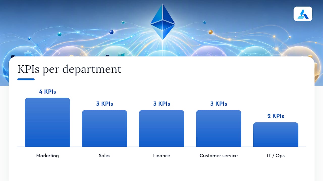
You don’t need fifty metrics. You need the right five to eight per department, each with a clear owner and a clear cadence. Here’s a starting list you can paste directly into a new dashboard.
Marketing
- Marketing qualified leads (leading, weekly, marketing manager)
- Cost per lead (leading, weekly, marketing manager)
- Website conversion rate (leading, weekly, marketing manager)
- Customer acquisition cost (lagging, monthly, CMO)
Sales
- Pipeline coverage ratio (leading, weekly, sales director)
- Win rate (lagging, monthly, sales director)
- Average sales cycle length (lagging, monthly, sales ops)
Finance
- Cash runway (lagging, monthly, CFO)
- Days sales outstanding (leading, monthly, controller)
- Gross margin (lagging, monthly, CFO)
Customer service
- First response time (leading, daily, support lead)
- Customer satisfaction score (lagging, weekly, support lead)
- Ticket backlog (leading, daily, support lead)
IT/Ops
- System uptime percentage (lagging, weekly, IT lead)
- Mean time to resolve (leading, weekly, IT lead)
Product/SaaS
- Net revenue retention (lagging, monthly, head of product)
- Feature adoption rate (leading, monthly, product manager)
The highest-leverage entries here are cost per lead in marketing and pipeline coverage ratio in sales. Both are leading indicators that surface trouble weeks before revenue confirms it, which is exactly when a fix still has time to work.
KPI Trees: Connecting Dashboard Signals to Drivers and Ownership
A dashboard tells you something moved. A KPI tree tells you why, and who owns the fix. It breaks a top-level goal into the drivers that feed it and assigns each driver to a person accountable for moving it, turning dashboard signals into accountable actions rather than interesting trivia.
Take a simple revenue tree: Revenue splits into new customer revenue and expansion revenue. New customer revenue splits again into lead volume and close rate. If close rate drops, the tree points straight at the sales director, not at “sales” in the abstract, and the dashboard’s watchlist should show that name next to the flagged metric.
A KPI tree becomes the system of record for whether an action actually moved the number it was supposed to move, closing the loop that a static dashboard never can.
Embed the tree logic directly into your dashboard’s watchlist column: instead of just flagging “close rate down 8%,” link the row to the owner and the specific driver in the tree. That single change turns a passive report into a working task list.
How to Pick the Right Dashboard for Your Audience
Before building anything, name who’s looking at it and what decision they need to make. A CEO deciding whether to cut spending needs something different from a support lead deciding who works the next shift.
- Identify the audience and their single most important decision.
- Pick one lagging metric that proves whether the strategy is working.
- Add two to three leading indicators that predict that lagging metric.
- Name an owner for each metric, not a department.
- Set a review cadence: daily for operational, weekly for tactical, monthly for executive.
- Confirm the data source actually updates on that cadence before building anything.
Red flags that mean a rebuild is overdue: nobody can explain what a metric on the dashboard means without checking a spreadsheet, the same number appears with two different values in two different tools, or the dashboard hasn’t changed even though the business has.
Rolling Out a New KPI Dashboard: Draft to Go-Live
Skipping straight from idea to production dashboard is how you end up with a chart nobody trusts. A short rollout sequence fixes that.
Phase 1: Define. Pick the objective and the one lagging metric that proves it, then list the leading indicators that predict it. Do this with the owner in the room, not for them.
Phase 2: Map. Match each KPI to a real data source and confirm it refreshes on the cadence the dashboard needs. This is where most rollouts quietly stall, because someone assumes a system updates daily when it actually updates weekly.
Phase 3: Draft. Build a working version with real data, even if the layout is rough. A draft with live numbers beats a polished mockup with placeholder data every time, because it surfaces data quality problems immediately.
Phase 4: Test with owners. Put the draft in front of the people who’ll use it daily and watch what they actually click on, not what you expect them to click on. Their questions tell you what’s missing.

Phase 5: Go live and loop back. Ship it, then revisit in two to four weeks. Metrics that nobody checks get cut. Metrics people keep asking for get added. This pattern, define, map, draft, test, launch, keeps a dashboard from calcifying into something built once and never touched again.
Common Mistakes That Sink KPI Dashboards
The most common failure isn’t a bad chart. It’s too many charts. Teams stack fifteen KPIs onto an executive dashboard because everything feels important, and the result is a wall nobody reads twice.
The second most common mistake is mismatched metric definitions. If marketing and sales calculate “qualified lead” differently, every dashboard built on top of that number is quietly lying to somebody. Standardizing definitions and naming a single owner for each metric’s definition prevents the slow drift where two teams argue over numbers that should already agree.
Third, dashboards without owners rot. A metric with no name attached to it is a metric nobody’s job depends on, and it stops getting checked within a month.
Fourth, all lagging metrics and no leading ones. A dashboard full of last month’s revenue and last quarter’s churn tells you what already happened. It gives leadership nothing to act on until the damage is done, which is exactly the trap pairing leading and lagging indicators is meant to avoid.
Fifth, building for the wrong cadence. A dashboard that updates monthly is useless to a support lead who needs hourly ticket counts, and a dashboard that refreshes every five minutes is noise to a CFO reviewing quarterly cash position.
Tools and Software Options for Building KPI Dashboards
Most teams already own a tool capable of building a decent dashboard. The gap usually isn’t software, it’s structure.
At the simple end, spreadsheet tools with pivot charts handle a single-department dashboard fine, especially for a small team that just needs a shared view of five or six numbers. They fall apart fast once multiple data sources need blending or real-time refresh matters.
Business intelligence platforms cover the next tier, connecting to multiple databases, refreshing automatically, and supporting the kind of layered KPI dashboard structure covered earlier, with drill-down for analysts and a clean summary view for executives.
Purpose-built strategy platforms sit above general BI tools by tying dashboards directly to a KPI tree, so a red metric on the dashboard links straight to its driver and owner instead of leaving that connection in someone’s head. That’s the layer where a customizable dashboard setup actually pays off, because the strategy and the metrics stop living in separate documents.
Whatever you choose, confirm it supports the refresh cadence your audience needs and that non-technical owners can update targets without filing a ticket with IT.
Best Practices for Keeping a Dashboard Alive
A dashboard is a living document, not a one-time build. Review every KPI on a schedule, quarterly at minimum, and ask a blunt question: has anyone acted on this number in the last month? If not, cut it or replace it.
Assign a data owner for every metric, someone accountable not just for the number but for its definition staying consistent across every dashboard it appears on. When a metric’s formula changes, that owner should be the one who updates it everywhere it’s used, not the last person who happens to notice a mismatch.
Version your dashboards the way you’d version code. When you add, remove, or redefine a KPI, note the date and reason somewhere visible. Six months from now, someone will ask why a number looks different than they remember, and “we changed the definition in March” is a far better answer than a shrug.
Finally, revisit cadence as the business changes. A metric that needed weekly review during a product launch might only need monthly attention once things stabilize, and forcing daily reviews on a number nobody’s actively managing just trains people to stop looking at the dashboard altogether.
Turning Dashboard Numbers Into Action
A number on a screen is worthless until someone decides what it means and what to do next. The skill worth building isn’t reading a dashboard, it’s interpreting one fast enough to act.
That combination points at demand, not efficiency, so the fix is a channel or offer problem, not a budget problem.
Or your support dashboard shows first response time creeping up while ticket volume stays flat. That’s a staffing or process issue, not a demand issue, and it means someone should be checking shift coverage before customer satisfaction scores start sliding a month later.
The pattern in both cases: read two metrics together, not one in isolation, because a single number rarely tells you what caused it or what to do about it. A dashboard that pairs a lagging result with the leading indicators feeding it does half the diagnostic work automatically, which is the entire argument for building dashboards around KPI trees instead of a flat list of unrelated charts.
Lessons From Building Dashboards for Strategy Teams
The biggest failure I’ve seen in dashboard design isn’t a bad chart choice. It’s watching a team build a beautiful dashboard nobody owns, and it goes quiet within a month because no single person’s job depended on any number on it.
The second lesson: focus beats completeness every time. A three-metric dashboard someone checks daily beats a twenty-metric dashboard someone opens once a quarter. Blue Prysm’s approach reflects that bias, mapping dashboard signals directly into a strategy library and real-time briefings so a red number always points to a named owner and a next step, not just a chart that looks concerning.
— Colin Bowdery
Blue Prysm: Building Dashboards That Connect to Strategy, Not Just Charts
Most dashboard tools stop at the chart. They’ll show you that pipeline coverage dropped, but they won’t tell you which strategic driver that connects to or who’s supposed to fix it. Blue Prysm builds that connection in from the start, mapping your KPIs directly to a strategy library and generating automated briefings when a metric crosses a threshold, so the dashboard doubles as an early warning system instead of a static report you check out of habit.
If you’re tired of rebuilding the same disconnected spreadsheet every quarter, the market analysis platform gives you real-time competitor tracking and KPI tracking in one place, built for teams without a dedicated analytics department. Start a trial and connect your first dashboard to an actual strategy driver this week, not next quarter.
Sources
- What Is a KPI Dashboard | Microsoft Power BI
- Leading versus lagging indicators guidance
- What is a KPI? How To Choose the Best KPIs for Your Business (HubSpot)
- KPI strategy for business growth
FAQ
What Are the Four Types of KPI Dashboards?
Executive, operational, tactical, and analytical dashboards, each built for a different audience and decision speed.
How Many KPIs Should an Executive Dashboard Show?
Between three and five strategic KPIs, kept tight enough that leadership can scan the whole view in seconds.
What’s the Difference Between a Leading and Lagging Indicator?
A lagging indicator confirms a result already happened, like revenue, while a leading indicator predicts it, like pipeline coverage.
What Is a KPI Tree and Why Does It Matter?
A KPI tree breaks a goal into its drivers and assigns an owner to each one, turning a flagged metric into an assigned action instead of a passive chart.
Can I Use a Spreadsheet Instead of Dashboard Software?
Yes, for a single department with a handful of metrics, though multi-source or real-time dashboards need a dedicated tool like Blue Prysm’s platform.