


Customizable reports deliver faster, more accurate decisions because they surface the right metrics for the right people instead of forcing everyone into the same generic dashboard. That’s the whole pitch, and it holds up whether you run sales, finance, product, or a five-person leadership team trying to figure out why last quarter’s numbers went sideways.
The mechanics behind that claim break down into a handful of concrete advantages, and you’ll recognize most of them the moment you’ve sat through a meeting where three departments showed up with three different versions of “the truth.”
- Time savings through automation, scheduled refreshes, and reusable templates
- Tailored visualizations that show the action a chart implies, not just the numbers behind it
- Unified data from CRM, finance, product, and marketing systems in one view
- Sharper decisions because the right KPIs sit in front of the right people
- Better collaboration through role-based dashboards and shared briefings
- Governance and accuracy via access controls, versioning, and data lineage
- Scalability that keeps pace as your data volume and headcount grow
Platforms like HubSpot’s report builder and NetSuite’s Report Builder have made this kind of flexibility standard in enterprise software. The catch, which we’ll get into, is that flexibility without discipline creates its own problem: dashboard fatigue. More on that later. First, let’s talk about where the time actually goes.
Key Takeaways
Customizable reports work because they combine automation, tailored visualization, and unified data sources into a system built around decisions rather than raw metrics.
| Point | Details |
|---|---|
| Design goal-first | Start every report with the decision it needs to support, not the data that happens to be available. |
| Choose a hybrid model | Use ready-made reports for daily operations and custom reports for strategic, cross-source analysis. |
| Govern before you scale | Set access permissions and saved versions before wide distribution to avoid untraceable errors. |
| Track KPI hygiene | Audit metrics quarterly and retire any KPI nobody referenced in a real decision. |
| Pilot with Blue Prysm | Build one role-based report using Blue Prysm’s strategy library and Agentic AI briefings to test adoption before a full rollout. |
What Are the Benefits of Customizable Reports for Busy Teams?
Custom reporting, defined simply, is the practice of building reports shaped around a specific analytical question rather than pulling whatever a vendor decided to ship as a default. Jaspersoft’s overview of custom reporting frames the core value as flexibility and precision, and that framing matters because it separates custom reporting from plain “reporting” the way a tailored suit differs from something off the rack. Both cover you. Only one fits.
The advantages of custom reports over static, one-size-fits-all reporting show up in four places: how much time you spend building and rebuilding reports, how clearly the output points to a decision, how much manual reconciliation your team avoids, and how well the whole system scales as your business changes shape. We’ll walk through each, in order, because they compound. A team that fixes its templates first finds the visualization work easier. A team that gets its data sources unified first finds its KPIs more trustworthy. Sequence matters here almost as much as the individual pieces.
Save Time and Cut Manual Work With Automation and Reusable Templates
The single biggest time sink in reporting isn’t analysis. It’s rebuilding the same report from scratch every Monday because nobody saved a template. Customizable reporting platforms fix this through scheduled runs, automated exports, threshold alerts, and a refresh cadence you set once and forget.
HubSpot’s documentation notes that refresh timing depends on report complexity: single-object reports update fast, but multi-source custom reports built through a report builder may refresh only every couple of hours. That’s a real tradeoff. You’re not getting real-time everything, but you’re getting a report that survives longer than one use, and that’s the point of a template in the first place.
Reusable, role-based templates solve a second problem: report sprawl. Without a template discipline, every manager builds a slightly different version of the same sales report, and now you’ve got fourteen dashboards nobody fully trusts.
- Set a refresh cadence that matches how often the underlying decision actually gets revisited (daily for ops, weekly for pipeline, monthly for board reporting)
- Build one canonical template per function, then let individual users filter it rather than clone it
- Automate exports for recurring stakeholder briefings instead of manually pulling numbers each cycle
- Set alert thresholds on the two or three metrics that actually trigger action
Pro Tip: Design every new report template around the goal it serves before you touch a single chart. Ask “what decision does this report make possible?” first. Templates built backward from a decision get reused. Templates built forward from available data get abandoned within a month.
Tailored Visualizations That Make Insights Obvious
A chart’s job is to answer a question fast enough that the reader doesn’t have to think about the chart itself. Line charts answer “what’s the trend?” Stacked bars answer “what’s the composition?” Scatter plots answer “is there a relationship?” Get the match wrong and you’ve built a pretty picture that slows people down instead of speeding them up.
Custom reporting tools let you choose the visual instead of accepting whatever the software defaults to, which matters more than it sounds like it should. Matomo’s custom reporting documentation, for instance, walks through how segments, filters, and dimension choices change which visual actually makes sense for a given dataset.
Here’s how that plays out on real business questions:
- “Is revenue growing or shrinking?” → a trend line over 12 months, not a single bar for the current quarter
- “Which channel drives the most signups?” → a stacked bar or pie showing composition by source
- “How does this region compare to that one?” → a grouped bar chart, side by side, not two separate reports
- “Where are we losing customers in the funnel?” → a funnel visualization with drop-off percentages at each stage
One insight worth stealing directly: label every chart with the question it answers, not just the metric it displays. “Monthly Recurring Revenue” as a title tells you what you’re looking at. “Is MRR Growing Fast Enough to Hit Our Q3 Target?” tells you what to do about it.
Pro Tip: If a stakeholder has to ask “so what does this mean?” after seeing a chart, the visualization failed, not the audience. Rebuild the chart, don’t re-explain it.
Combine Multiple Data Sources Into a Single Source of Truth
Most operational headaches don’t come from bad data. They come from three good datasets that disagree with each other because nobody checked how they were joined. Customizable reports that pull from CRM, finance, product, and marketing systems simultaneously solve the reconciliation problem, but only if you understand how joins actually behave.
HubSpot’s own documentation is blunt about this: choosing a different primary data source, or joining on the wrong date field, can cause a record to be counted more than once when associations exist between objects. That’s not a hypothetical edge case. It’s the single most common reason two “identical” reports show different totals.
Before you trust a multi-source report enough to act on it, run through this checklist:
- Confirm which data source is primary and which is secondary, and understand how that choice filters the rows you see
- Recount records manually on a small sample after any join change, before trusting the automated total
- Check which date field drives your time filters (created date versus closed date versus last modified can each tell a different story)
- Flag associative relationships that might duplicate rows across joins
Pro Tip: When two data sources genuinely can’t be joined cleanly, don’t force it. Build a connective table or run a lightweight ETL step instead of layering filters on top of a bad join. A workaround built on a flawed foundation just moves the error somewhere harder to spot.
Read more on unifying operational data in Netverge’s guide to unified dashboards for IT leaders, which covers the integration patterns behind this problem from an infrastructure angle.
Turn Metrics Into Decisions: Measuring Performance and ROI
A KPI without the right aggregation attached is just a number floating in space. “Average deal size” and “total deal size” tell wildly different stories from the same underlying data, and picking the wrong one is how a sales team convinces itself business is booming while the pipeline quietly shrinks.
Dimensions describe what you’re slicing (region, product, rep, channel). Measures describe what you’re counting (revenue, count of deals, average time to close). Getting these two concepts straight, and choosing the right aggregation for each measure, is the difference between a report that supports a decision and one that just looks busy.
| Function | Sample KPI | Recommended Aggregation | Typical Data Source |
|---|---|---|---|
| Sales | Average deal size | Average | CRM |
| Marketing | Cost per qualified lead | Sum divided by count | Marketing automation platform |
| Product | Weekly active users | Distinct count | Product analytics tool |
| Finance | Monthly recurring revenue | Sum | Billing/finance system |
| Customer success | Churn rate | Percentage of total | CRM plus billing system |
Custom reports built for ROI tracking should pull the KPI, the aggregation, and the source together in one place rather than making a manager stitch three exports together in a spreadsheet. That stitching is exactly the manual work Sunnet’s write-up on custom reporting in business software points to as one of the biggest time drains custom reports eliminate.
- Pair every KPI with its aggregation method in the report design, not just in a footnote
- Confirm distinct count versus total count before reporting anything user or account related
- Revisit KPI definitions quarterly. A metric that made sense at 50 customers might mislead at 5,000
For a broader framework on turning metrics into decisions rather than just dashboards, Blue Prysm’s guide to decision-making best practices walks through the logic in more depth.
Improve Team Alignment, Accountability, and Distribution
The most underrated benefit of customizable reports isn’t analytical at all. It’s political. When every team pulls their own numbers from their own spreadsheet, meetings turn into arguments about whose data is right before anyone gets to discuss what to do about it. Shared, role-based dashboards end that argument before it starts, because everyone is looking at the same source.
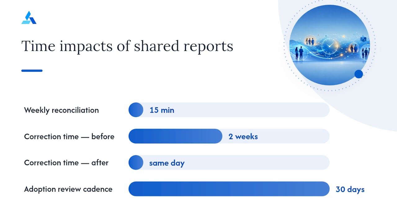
Consider a mid-size operations team that used to spend the first fifteen minutes of every weekly sync reconciling numbers between the ops lead’s spreadsheet and the finance team’s export. Once they moved to a shared dashboard with role-based views, that reconciliation time disappeared, and the meeting shifted to actually deciding what to do about the metric everyone now agreed on. The correction that used to take two weeks to surface got flagged the same day.
Rolling this out across a team doesn’t require a massive project. It requires sequencing:
- Assign one report owner per function who’s responsible for template accuracy
- Set permission tiers so executives see summary views while analysts see the underlying detail
- Establish a distribution cadence (weekly briefing, monthly deep dive) and stick to it
- Train the team on where to ask questions when a number looks wrong, rather than quietly ignoring it
- Review adoption after 30 days and cut any report nobody’s opening
- Role-based views reduce the noise each person has to filter through manually
- Scheduled briefings replace status-update meetings with something people can read on their own time
- Shared access controls prevent the “who edited this” confusion that erodes trust in numbers
Blue Prysm’s piece on customizable briefings for better decisions goes deeper on structuring role-based distribution if you’re rolling this out for the first time.
Interactive Filters and Exploratory Analysis for Faster Root-Cause Work
Static reports answer the question you thought to ask when you built them. Interactive reports answer the question you didn’t think of until you saw the first chart. That difference is what separates a report from an actual analytical tool.
Filter controls, drill-to-detail views, hover tooltips, and parameterized date ranges let an analyst chase a follow-up question in seconds instead of filing a request and waiting three days for a rebuilt report. Matomo’s documentation on custom report segmentation shows how layering AND/OR filter logic onto a single base report lets one dashboard answer dozens of different questions without duplicating the underlying build.
A typical exploratory workflow looks like this: revenue dips in one region, so the analyst filters by region, then drills into product category, then filters again by acquisition channel, and finds the actual cause: a single channel’s conversion rate collapsed in that one region only. That’s four questions answered from one interactive report instead of four separate report requests.
- Filter controls let a viewer narrow the view without touching the underlying query
- Drill-to-detail features let someone go from summary to row-level data in one click
- Parameterized date ranges keep a single report useful across daily, weekly, and quarterly reviews
Pro Tip: Limit any single interactive report to two or three filter dimensions maximum. Every additional filter option you add multiplies the number of ways a viewer can misread the data, and that’s how “interactive” quietly turns into “confusing.”
Accuracy, Governance, and Reducing Reporting Errors
Flexibility without governance is how you end up with a report that’s technically customizable and practically untrustworthy. NetSuite’s Report Builder documentation is explicit that permissions determine who can customize or save a report, which matters because an unlocked report anyone can edit is a report nobody can fully trust three months later.
Data lineage, in plain terms, is the paper trail showing where a number came from and what transformations happened to it before it hit the screen. Without that trail, debugging a wrong number means guessing. With it, you check the lineage and find the broken join in minutes.
| Governance Control | What It Does | Why It Matters |
|---|---|---|
| Access permissions | Restricts who can edit versus view | Prevents accidental changes to shared reports |
| Saved versions | Preserves a snapshot before edits | Allows rollback if a change breaks something |
| Transformation record | Documents joins, filters, calculations applied | Speeds up debugging when numbers look wrong |
| Refresh cadence settings | Controls how often data updates | Sets expectations for how current a report actually is |
Before sharing any executive-level report, run this check: confirm the data source hasn’t changed since the last review, confirm the refresh cadence matches the decision timeline, confirm no unauthorized edits sit in the version history, and confirm the report owner has actually reviewed the output, not just the query.
- Restrict edit permissions to the report owner; leave view access broader
- Save a version before every structural change, not just major ones
- Pause processing on unused reports rather than letting them run and consume resources indefinitely, a practice Matomo’s own documentation recommends for exactly this reason
How to Implement Customizable Reports: Roles, Timeline, and Cost
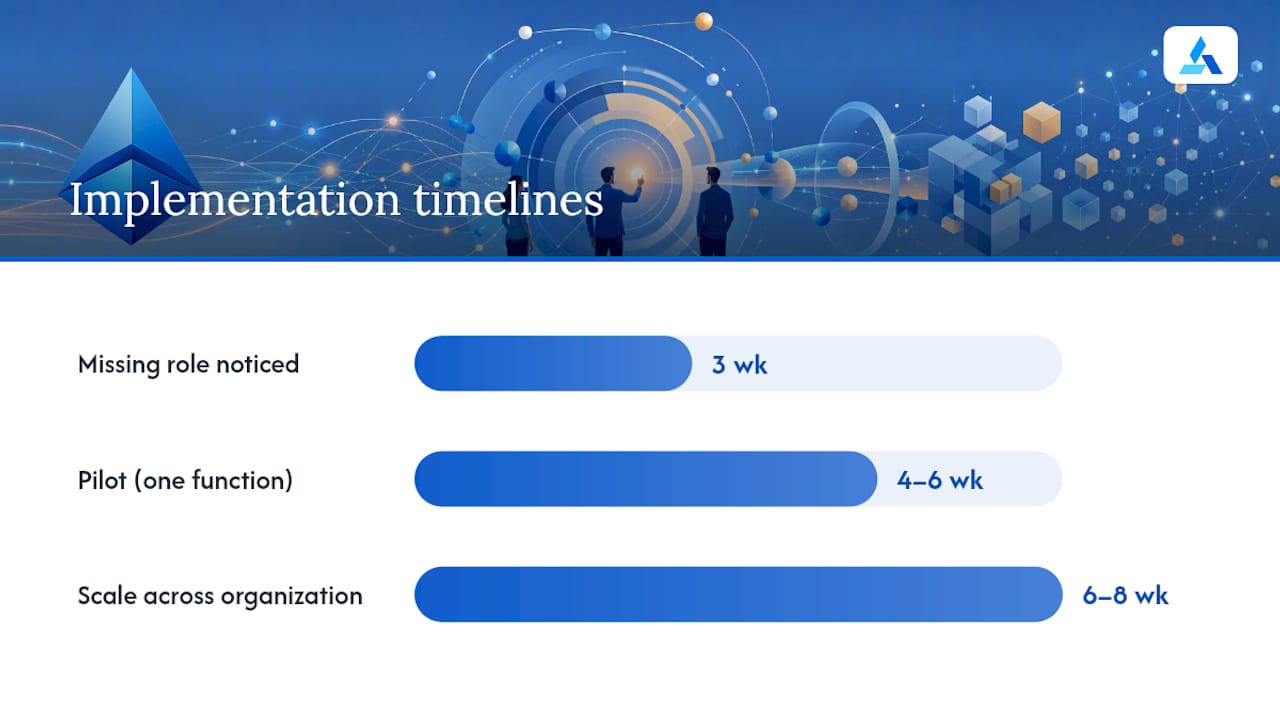
Getting a custom reporting program off the ground doesn’t require a six-month IT project, but it does require the right people in the room before you write a single query. Skip a role and you’ll find out the hard way three weeks in.
- Sponsor — an executive who defines the business goal the report program serves
- Report owner — the person accountable for accuracy and template maintenance
- Data engineer or analyst — builds the joins, sets up sources, handles refresh logic
- End users — the people whose decisions the report is actually meant to support
- QA reviewer — someone who checks the numbers before wide distribution
- Rollout lead — manages training, permissions, and adoption tracking
A realistic timeline for a mid-size report program runs four to six weeks for a pilot covering one function, then another six to eight weeks to scale across the organization once the pilot’s template proves out. Cost drivers cluster around three things: the complexity of the data joins (more sources means more engineering time), the refresh frequency you demand (real-time costs more than daily), and the permission model complexity (role-based access for a hundred users takes more setup than a flat, everyone-sees-everything structure).
Not every report needs to be built from scratch, and knowing when to reach for a ready-made template versus a fully custom build saves real time.
| Scenario | Best Fit | Why |
|---|---|---|
| Standard operational metrics (daily sales, ticket volume) | Ready-made report | Fast to deploy, consistent format, low maintenance |
| Cross-functional strategic analysis | Custom report | Needs joined data sources and tailored KPIs |
| One-off investigation into an anomaly | Custom report | Requires interactive filtering not available in fixed templates |
| Recurring executive briefing | Hybrid | Ready-made base, customized visualization layer on top |
That hybrid model, blending fast operational reports with strategic custom builds, is exactly what Talboard’s guidance on ready-made versus custom reports recommends for organizations scaling past their first few reporting tools. Trying to force every report into a fully custom build wastes engineering time on problems a template already solved.
Research-Backed Pitfalls and How to Avoid Them
Dashboard fatigue is a documented, named problem, not just a complaint. Randstad’s career guidance on KPI reporting describes it as teams drowning in disconnected, overcomplicated metrics that don’t tie back to any actual organizational goal. The fix isn’t fewer dashboards. It’s dashboards built from the goal outward instead of the data inward.
Metric overload compounds the problem. Add a KPI because it’s available, not because it drives a decision, and you’ve made every report slightly harder to read for a benefit nobody uses.
- Start every report design with the organizational goal, then work backward to the two or three metrics that actually measure progress toward it
- Run a quarterly KPI audit and cut any metric nobody’s referenced in a decision in the past 90 days
- Track adoption, not just existence. A report nobody opens isn’t a governance win, it’s a maintenance cost
- Pause or archive reports tied to discontinued initiatives instead of letting them accumulate
Pro Tip: Once a quarter, ask every report owner one question: “What decision did this report change last month?” If the answer is nothing, the report either needs a redesign or it needs to be retired.
Integration Capabilities With Existing Business Tools
Customizable reporting only delivers on its promise if it plugs into the systems your team already uses instead of demanding a wholesale platform switch. That means connectors into your CRM, your finance and billing systems, your product analytics tool, and your marketing automation platform, all feeding the same reporting layer without a manual export step in between.
The practical test of integration quality isn’t how many logos appear on a vendor’s website. It’s whether a change in your CRM shows up in a downstream report without someone manually re-exporting a spreadsheet. Weak integrations force analysts back into copy-paste workflows, which quietly undoes every time-saving benefit automation was supposed to deliver in the first place.
When evaluating any reporting platform’s integration depth, check three things: whether it supports two-way sync or just one-way export, how it handles schema changes in the source system without breaking downstream reports, and whether refresh timing across connected sources stays consistent enough that you’re not comparing yesterday’s CRM data against this morning’s finance numbers.
What Customizable Reports Mean for Strategy Work
Reporting used to be treated as a downstream chore, something you did after the strategic decision got made, to justify it after the fact. That framing has it backward. The teams that move fastest treat reporting as an upstream input to strategy itself, not a receipt for decisions already taken.
What gets lost in most conversations about reporting flexibility is that the real bottleneck was never the visualization layer. It was the time between “something changed in the market” and “a person with authority actually saw that it changed.” Agentic AI collapses that gap by generating the briefing before someone has to think to ask for it, which is a fundamentally different capability than a prettier chart.
The honest measure of whether a customizable reporting rollout worked isn’t how many dashboards exist six months later. It’s whether decisions got faster and whether the people making them trusted the numbers enough to act without a second meeting to double check. Track adoption rate, track how many decisions cite the report by name, and track whether the time between question and answer actually shrank. If none of those moved, the rollout added dashboards, not decision speed.
How Blue Prysm Speeds Up Customizable Reporting
Most reporting platforms hand you the tools and leave the discipline part to you: figuring out which KPIs matter, building the template, catching the dashboard fatigue before it sets in. Blue Prysm’s Agentic AI approach flips that order, generating the briefing and the relevant metrics automatically instead of waiting for someone to build the query.
Practically, that shows up in a few specific capabilities:
- Automated competitive intelligence briefings that arrive already formatted around a decision, not a raw data dump
- A strategy library with more than 50 frameworks and templates, cutting report sprawl by giving every team a consistent starting point
- Role-based briefings that route the right level of detail to executives versus analysts without manual filtering
- Integration connectors that pull real-time market insights alongside your existing business data
If your team is tired of rebuilding the same competitive analysis every quarter, Blue Prysm’s market research tools are built to take that manual step out entirely. Start a trial and see how quickly a role-based briefing replaces the spreadsheet your team’s been patching together.
Sources
- Understand the custom report builder – HubSpot
- Report Builder and custom reports – NetSuite docs
- Ready-Made Reports vs Custom Reports: What Growing Organizations Actually Need | Talboard
FAQ
What can you do with custom reports?
Custom reports let you combine data sources, choose specific KPIs and aggregations, build tailored visualizations, and automate distribution to role-based audiences, all shaped around a specific business question rather than a generic template.
What are the advantages of using custom software for reporting?
Custom reporting software reduces manual reconciliation across spreadsheets, surfaces business-specific patterns like channel or segment performance, and lets teams automate recurring analysis instead of rebuilding it each cycle.
What are the four types of reports?
Common categories include operational reports (daily metrics), analytical reports (trends and root causes), strategic reports (cross-functional, goal-tied analysis), and compliance or governance reports (audit trails and access records); exact taxonomies vary by industry.
What does “custom report” mean?
A custom report is one built around a specific analytical question using chosen dimensions, measures, filters, and data sources, rather than a fixed, pre-built template that treats every user’s needs the same way.
How do customizable reports reduce dashboard fatigue?
Dashboard fatigue comes from too many disconnected metrics with no clear tie to a goal; customizable reports reduce it by starting from the organizational goal and keeping only the KPIs that measure progress toward it, a practice Blue Prysm’s Agentic AI briefings apply by generating decision-focused summaries instead of raw metric dumps.