

The Value Proposition Canvas is a one-page tool that maps a specific customer segment’s jobs, pains, and gains to concrete product pain relievers and gain creators. Its job is simple: find the overlap between what your customer actually needs and what you actually built, so you can spot product-market fit before you overspend chasing it. Skip the theory today. Pick one segment, write one testable hypothesis, and go test it.
TL;DR:
- The Value Proposition Canvas emphasizes quantifiable pains and gains, requiring specific, measurable outcomes rather than vague descriptions like efficiency.
- It should focus on one or two key jobs per segment to avoid feature overload and maintain clarity in addressing customer needs.
- Validating the canvas involves testing hypotheses through targeted experiments, such as A/B testing or manual MVPs, rather than relying solely on a completed, unchallenged map.
- Most teams fail to validate their canvas because they treat it as a static deliverable instead of a living, evidence-based tool that requires regular updates and testing.
- Blue Prysm accelerates validation by providing real-time market analysis and competitor insights that shorten research time and enhance evidence-based decision making.
What Is the Value Proposition Canvas, and How Does It Relate to the Business Model Canvas?
The canvas splits into two halves that face each other on the page. On the right sits the Customer Profile: the jobs your customer is trying to get done, the pains that make those jobs harder, and the gains they’re hoping for. On the left sits the Value Map: your products and services, the pain relievers those products offer, and the gain creators they deliver. Fit happens when the value map addresses the critical elements of the customer profile. It’s not when it looks impressive on a slide.
If you’ve used the Business Model Canvas before, think of the Value Proposition Canvas as a magnifying glass held over two of its nine boxes: value proposition and customer segments. The Value Proposition Canvas is a zoom-in on the Business Model Canvas, built to answer one narrow, urgent question the bigger canvas can’t answer on its own: does this specific offer actually fit this specific customer? That’s the whole reason it exists as a standalone tool instead of getting absorbed into its parent framework.
This is where the business model canvas vs lean canvas vs value proposition canvas debate usually gets muddled, so let’s clear it up. The Business Model Canvas maps your entire operation: revenue streams, cost structure, key partners, channels. The lean canvas model, a startup-flavored cousin of the BMC, swaps some of those boxes for problem statements and unfair advantage. Neither one forces you to get granular about customer psychology. The Value Proposition Canvas does exactly that, and only that.
Here’s when to reach for each:
- Use the Value Proposition Canvas when you’re pre-product-market fit, entering a new segment, or repositioning an existing offer that’s stopped converting.
- Use the Business Model Canvas when you’re mapping the whole venture, including how money moves and who your key partners are.
- Use the lean canvas when you want a faster, startup-specific version of the BMC that front-loads problem and solution assumptions.
- Use all three together at different zoom levels: BMC for the business, VPC for the offer, lean canvas as a lighter alternative to BMC in the earliest days.
None of these replace customer interviews. They organize what the interviews tell you.
Customer Profile: Mapping Jobs, Pains, and Gains With Specificity
Vague customer profiles produce vague strategy. If your “pain” reads like “inefficiency,” you haven’t written a pain. You’ve written a mood. Specificity is what turns a canvas from a workshop souvenir into an actual strategy tool.
Start with jobs, and break them into three flavors:
- Functional jobs: the concrete task, like “reconcile invoices before month-end close.”
- Social jobs: how the customer wants to be perceived while doing the job, like “look competent in front of the board.”
- Emotional jobs: the feeling they’re chasing or avoiding, like “stop dreading Monday’s finance meeting.”
For each job, log frequency (daily? quarterly?) and the trigger that kicks it off. A job that fires once a year behaves nothing like one that fires every shift.
Pains follow the same discipline. “Slow reporting” is a mood, not a pain. “Finance spends six hours every close cycle re-keying numbers between two systems” is a pain you can price. Quantify pains in time, cost, or risk wherever you can, because that’s the unit your value map will need to speak back in.
Gains get ranked, not just listed. Ask which gain the customer would fight hardest to keep if you had to cut one. That single answer usually reveals the must-win job your whole value proposition should orbit.
None of this comes from a brainstorm. Pull verbatim quotes from customer interviews, lines from support tickets, and specific snippets from product analytics, since practitioners consistently recommend grounding every box in evidence someone actually said or did, not what your team assumes they’d say.
Pro Tip: Write every pain and gain in the customer’s own words, sticky note by sticky note, before your team edits anything into “professional” language. The moment you smooth out a quote, you usually smooth out the insight that made it useful.
Value Map: Turning Features Into Pain Relievers and Gain Creators
A feature list is not a value proposition. A pain reliever only earns its place on the map when it points back at a specific pain you already wrote down, and a gain creator only counts when it produces a result the customer can measure for themselves.
Weak phrasing sounds like “improves efficiency.” Strong phrasing sounds like “eliminates 3 hours of manual data entry per week,” a distinction that’s the actual line between a vanity exercise and a working strategy tool. Try these phrasing templates when you draft your own:
- Pain reliever: “Reduces [specific pain] by [measurable amount] through [mechanism].”
- Pain reliever: “Removes the need for [specific workaround customers currently use].”
- Gain creator: “Delivers [specific outcome] within [timeframe].”
- Gain creator: “Gives [specific stakeholder] visibility into [specific metric] without [current cost].”
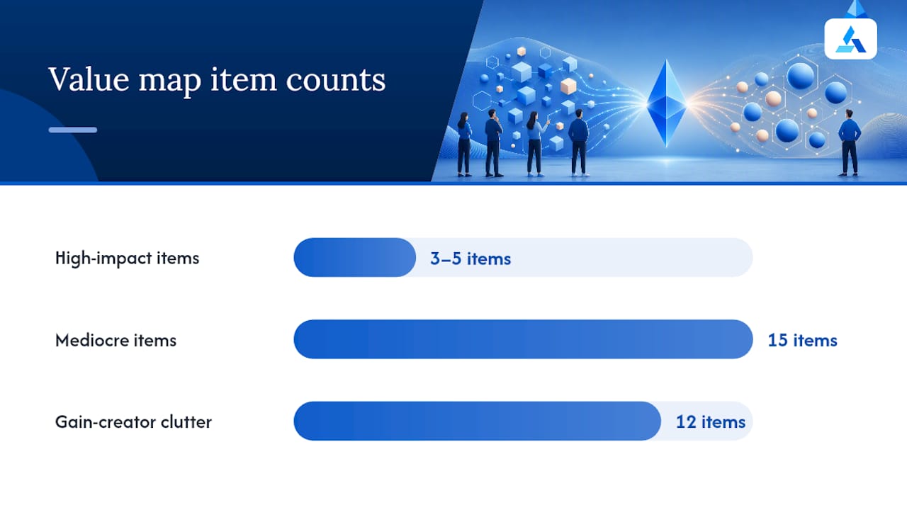
Keep the value map tight. Three to five high-impact relievers and creators beat fifteen mediocre ones, and this discipline matters more than most teams expect: specificity and measurable outcomes are what separate a real value proposition from a wish list dressed up as strategy. Every extra bullet you add past that range dilutes the ones that actually matter.
Feature-dumping is the most common way teams sabotage their own canvas. Engineering ships a feature, marketing wants it on the map, and suddenly you have twelve gain creators competing for attention instead of three that solve the must-win job. Before you add anything to the value map, ask one question: which specific pain or gain from the customer profile does this address? If you can’t answer in one sentence, it doesn’t belong on the map yet. It belongs on a backlog for later.
Language matters here too. “Our platform leverages AI” describes your architecture. “Cuts your competitor research from four hours to twenty minutes” describes your customer’s Tuesday. Write for the second one.
How to Run a 60 to 90 Minute Canvas Session (Or a Solo Version)
You don’t need a two-day retreat to fill out a value proposition canvas with AI tools for startups properly. You need focused pre-work, a tight agenda, and a scoring method that forces prioritization instead of consensus by exhaustion.
Before the session:
- Pick exactly one customer segment. Not “small businesses.” Not “enterprise buyers.” One named, describable segment.
- Gather three to five pieces of verbatim evidence: interview transcripts, support ticket language, or analytics snippets tied to that segment.
- Print or screen-share a blank canvas template so nobody’s rebuilding boxes from memory.
During the session (60 to 90 minutes):
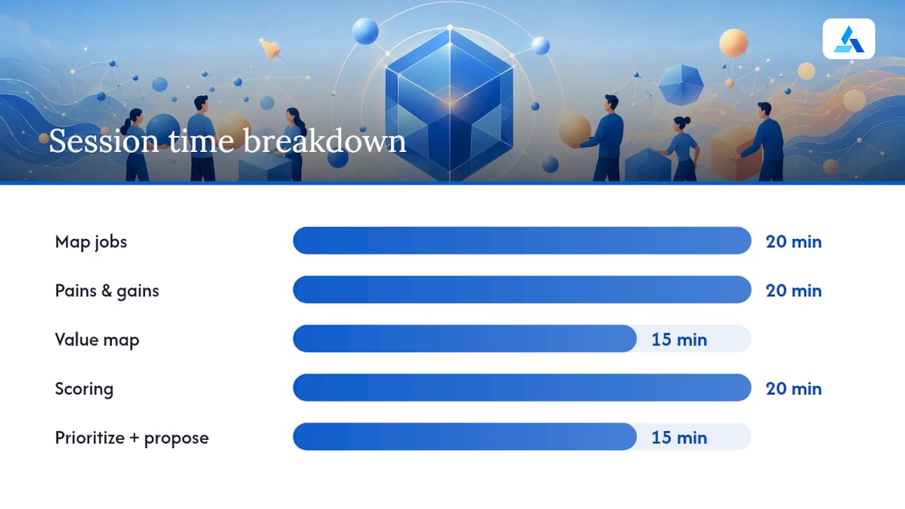
- Minutes 0 to 20: map jobs first, functional before social before emotional. Resist the urge to jump to solutions.
- Minutes 20 to 40: map pains and gains against those jobs, pulling directly from your evidence pile, not from opinion.
- Minutes 40 to 55: flip to the value map. Draft pain relievers and gain creators that respond to specific items on the right side.
- Minutes 55 to 75: score each job using an impact times confidence grid, a method practitioners rely on to separate the jobs worth building around from the ones that just felt loud in the room.
- Minutes 75 to 90: circle the one or two must-win jobs and draft a single value proposition sentence around them.
Running this solo? Compress the same sequence into three focused blocks across a day: evidence review, mapping, and scoring. The impact times confidence grid works just as well against your own honest estimate as it does against a room of six people arguing.
Your outputs, either way, should be two things: one clear value proposition sentence, and three specific experiments designed to prove or break it. If your session produces a beautifully colored canvas and nothing else, you ran a workshop, not a strategy exercise.
If you want a faster route to the evidence-gathering step, tools built for AI-powered competitive mapping can shorten the research phase considerably, giving your team more of the 90 minutes for actual debate instead of data hunting.
How Do You Test and Validate a Value Proposition Canvas?
A finished canvas is not a validated canvas. It’s a map of your best current guesses, and the entire point of filling it out is to find the guess most likely to be wrong, then go break it on purpose. Treat every box as a hypothesis, not a conclusion, an approach practitioners actively recommend over letting a completed canvas quietly graduate into “fact” just because it’s written down.
Start interviews trying to disprove your own assumptions, not confirm them. Instead of asking “would you find this useful,” ask “walk me through the last time this problem happened,” and let the customer’s actual story tell you whether the pain is as sharp as you assumed.
Once you have a sharpened hypothesis, cheap experiments tell you more than expensive builds:
- A/B test hero copy on a landing page using two different pain relievers as the headline.
- Run a bare landing page before any product exists, and measure sign-up intent against real traffic.
- Send cold outreach framed around one specific gain creator, and track reply rates by message variant.
- Build a concierge MVP, delivering the value manually before you automate anything, to confirm the outcome even matters.
Sean Ellis’s widely cited “40% rule” holds that if fewer than 40% of your users would be disappointed if your product disappeared tomorrow, you probably haven’t found real product-market fit yet. It’s a rough heuristic, not a law, but it’s a useful gut check against a canvas that looks convincing on paper but hasn’t earned real customer attachment.
Decision time comes down to three honest options. Iterate when the job is right but the reliever misses. Pivot when the job itself doesn’t matter enough to the segment you picked. Scale only when evidence, not enthusiasm, backs the fit.
Real Examples, Common Mistakes, and a Practitioner Checklist
B2B SaaS example: A project management tool targeting agency operations managers mapped the job “prove billable hours to clients without manual spreadsheet work.” The pain: “spends 5 hours weekly reconciling timesheets across three tools.” The pain reliever: “auto-syncs timesheets across your stack and generates client-ready reports in one click.” The gap this canvas exposed: the gain creator promised faster invoicing, but nobody had validated whether operations managers or finance owned that budget decision, a B2B buying-committee blind spot that shows up constantly when teams map only one stakeholder.
B2C example: A meal-kit service mapped the emotional job “feel like a competent home cook without the grocery run.” The gain creator, “pre-portioned ingredients with a 20-minute recipe,” mapped cleanly. The gap: the canvas never captured the social job, “have something to post about at dinner,” which turned out to drive more referrals than the time savings did. Good annotated examples reveal gaps like this rather than presenting a flawless finished product.
Common mistakes worth naming directly:
- Writing pains as vague moods instead of quantified, specific frictions.
- Trying to solve every job on the canvas instead of committing to one or two must-win jobs.
- Treating a filled-in canvas as validation, when it’s actually a hypothesis waiting to be tested.
- Building a value map from an internal feature roadmap instead of from customer evidence.
Pro Tip: Before you call any canvas “validated,” run it through this checklist: Is every pain quantified? Is every gain creator tied to a measurable outcome? Have you talked to at least five real customers in this exact segment? Have you run at least one experiment designed to disprove your top hypothesis? If any answer is no, you have a draft, not a validated canvas.
Best Practices: Cadence, Ownership, and Scaling Canvases for B2B Buys
One canvas rarely covers a real B2B sale. Enterprise deals move through multiple decision-makers with different jobs, pains, and gains, and collapsing them into a single canvas usually means you’ve optimized for whichever stakeholder was loudest in your interviews. Plan for two to three canvases per product when a buying committee is involved, one per distinct role, because skipping this step is a common way deals stall at the decision-criteria stage nobody mapped.
Update cadence should follow triggers, not the calendar. Revisit the canvas when you ship a feature that changes a pain reliever, when new interview evidence contradicts an existing assumption, or when a customer’s switching trigger shifts, say, a new competitor enters or a regulation changes their urgency. Product-market fit is not a milestone you hit once. It’s a standing process you revisit as the market moves under you.
Ownership works best with one accountable owner, usually product or product marketing, who translates canvas items into action:
- Convert each must-win job into a specific roadmap ticket with the pain reliever spelled out as the acceptance criteria.
- Feed the value proposition sentence directly into sales enablement and landing page copy, so messaging and product stay tied to the same evidence.
- Treat the canvas as a decision-making compass for what to deprioritize, not just what to build, since saying no to features that don’t map to a pain is half the value of doing this exercise at all.
If your growth strategy involves entering a new segment, revisit how you identify high-impact opportunities before you draft a new canvas for it. Mapping the wrong segment carefully still produces the wrong answer carefully.
Why Most Canvases Fail Before They’re Even Tested
Here’s the uncomfortable truth about the Value Proposition Canvas: most teams fill it out correctly and still get it wrong, because the canvas rewards specificity and punishes confidence. A team that writes “reduces onboarding friction” feels good about their workshop. A team that writes “cuts onboarding from 14 days to 3 by auto-importing existing CRM data” feels exposed, because now there’s a number someone can prove false. Exposure is the point. If your canvas doesn’t make anyone in the room slightly nervous about being wrong, you haven’t gotten specific enough to learn anything.
The second failure mode is subtler: teams treat the canvas as a deliverable instead of a living argument. It gets built once, presented once, and archived. But a value proposition that was true for your segment eighteen months ago may not survive a new competitor, a pricing shift, or a change in how your customer’s job even gets triggered. The canvas isn’t a strategy document. It’s a bet you’re placing, and bets need to be revisited when new information arrives, not filed away because the workshop already happened.
Most founders I’d expect to see run a Puffery Detector against their own pitch decks would find their gain creators read more like investor slides than customer evidence. That gap between what sounds compelling in a room and what a customer would actually pay to keep is exactly where the Value Proposition Canvas earns its place, provided you’re willing to let it prove you wrong.
— Colin Bowdery
How Blue Prysm Speeds Up Canvas Validation
Filling out a canvas by hand gets you organized. It doesn’t get you evidence fast, and evidence is the part that actually takes time: pulling competitor positioning, sourcing customer language, and figuring out which job is genuinely worth betting on. Blue Prysm exists for that gap. Instead of a workshop that runs on gut feeling and sticky notes, you get real-time market analysis, competitor tracking, and a strategy framework library with over 50 templates pulling structure directly from your canvas outputs into an actual roadmap.
Three ways to put this to work right now. Run a Venture Quick Score against your must-win job to see whether the hypothesis holds up under scrutiny before you spend a quarter building around it. Pull a sample intelligence briefing to see how fast Blue Prysm surfaces competitor and market evidence you’d otherwise spend days chasing manually. Or browse the strategy framework library for templates that turn your canvas’s must-win job straight into roadmap tickets and messaging.
Pricing starts at $30 per month for the Starter plan, or $299 per year, with Pro and Enterprise tiers available as your validation work scales. If you’d rather have a strategist run the process with you directly, the AI Operational Audit and Corporate & Growth Strategy engagements apply the same evidence-first approach to your specific market.
Sources
Strategyzer’s original Value Proposition Canvas template remains the cleanest starting point if you want the unmodified structure before you adapt it. Beyond the template itself, the practitioner writeups cited throughout this piece cover scoring grids and prioritization methods in more depth, and annotated real-company examples are worth studying specifically for the gaps they expose, not the polish they show. If you’re building interview scripts, the hypothesis-first testing approach referenced above is a solid foundation to adapt to your own segment.
- Value Proposition Canvas: How to Map Customer Fit (With Examples)
- The Value Proposition Canvas
- Value Proposition Canvas: What It Is, Template & Examples
- The Elements of Consumer Value
FAQ
What are the five key values of a value proposition?
Definitions vary across frameworks, but the Value Proposition Canvas itself centers on matching customer jobs, pains, and gains against your pain relievers and gain creators, five elements total across both halves of the canvas.
What is a good example of a value proposition?
A strong value proposition names a specific customer, a specific job, and a measurable outcome, such as “helps agency operations managers cut client billing reconciliation from five hours to twenty minutes weekly,” rather than a generic claim like “saves you time.”
How do you fill out a Value Proposition Canvas?
Start with the Customer Profile side: list jobs, then pains, then gains, using verbatim customer evidence rather than internal assumptions, then move to the Value Map side and draft pain relievers and gain creators that respond directly to what you just mapped.
What is the difference between a Business Model Canvas and a Value Proposition Canvas?
The Business Model Canvas maps your entire venture, including revenue, costs, and partners, while the Value Proposition Canvas zooms into just two of those elements, value proposition and customer segments, to test product-customer fit in more detail.
How much does Blue Prysm cost?
Blue Prysm’s Starter plan runs $30 per month or $299 per year, with Pro and Enterprise tiers available for teams that need deeper market research and strategy tooling, all listed on the pricing page.