


TL;DR:
- Descriptive statistics summarize and visualize datasets to reveal their main features at a glance.
- They are essential as a foundation for reliable data analysis and accurate business insights.
Data descriptive is the process of summarizing and visualizing datasets using statistical measures and charts to reveal their main characteristics at a glance. The standard industry term is descriptive statistics, and it covers measures of central tendency, dispersion, and distribution shape. These methods form the mandatory first step before any inferential or predictive analysis. Descriptive statistics serve as the foundation of data analysis by summarizing datasets through measures like mean, median, mode, standard deviation, and interquartile range. Skipping this step is not a shortcut. It is a liability.
What are the main types of descriptive statistics?
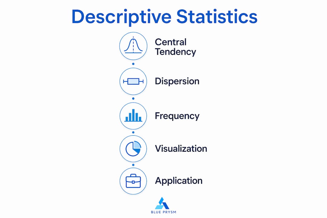
Descriptive analysis techniques fall into three main groups: measures of centrality, measures of dispersion, and measures of frequency distribution. Each group answers a different question about your data. Together, they give you the full picture.
Measures of central tendency
Central tendency tells you where your data clusters. The mean is the arithmetic average. The median is the middle value when data is sorted. The mode is the most frequently occurring value. Choosing the wrong one distorts your entire analysis. Using the mean on skewed data is a major error because outliers pull it away from the true center. The median is the correct choice when your data has outliers or a skewed distribution.

Measures of dispersion
Dispersion tells you how spread out your data is. Standard deviation measures average distance from the mean. Variance is the square of standard deviation. Range is the gap between the highest and lowest values. The interquartile range (IQR) measures the middle 50% of values and resists the influence of outliers. A dataset with a small standard deviation is consistent. A large one signals high variability that may require investigation before any model is built.
Measures of frequency distribution
Skewness measures whether your data leans left or right of center. Kurtosis measures how heavy the tails of your distribution are. Both matter because they reveal whether your data behaves the way standard models assume. Ignoring skewness and kurtosis is one of the fastest ways to build a model that looks good in testing but fails in production.
| Measure | Category | What it tells you |
|---|---|---|
| Mean, Median, Mode | Central tendency | Where data clusters |
| Standard deviation, IQR | Dispersion | How spread out values are |
| Skewness | Distribution shape | Whether data leans left or right |
| Kurtosis | Distribution shape | How heavy the tails are |
| Range | Dispersion | Gap between min and max values |
Pro Tip: Never report the mean without also reporting the standard deviation. A mean without context is a number without a story.
How does data visualization improve descriptive communication?
Choosing the right chart is not about aesthetics. Effective data communication requires selecting visual formats based on the analytical job the chart needs to do. Analysts who pick charts based on what looks nice routinely obscure the very insight they are trying to communicate.
Five core visualization objectives determine which chart type is correct:
- Comparison: Use bar charts or column charts to show differences between categories. A marketing team comparing campaign performance across five channels needs a bar chart, not a pie chart.
- Distribution: Use histograms or box plots to show how values spread across a range. A sales analyst checking whether deal sizes follow a normal distribution needs a histogram.
- Relationship: Use scatter plots to show correlation between two variables. A data scientist testing whether ad spend correlates with revenue needs a scatter plot.
- Composition: Use stacked bar charts or pie charts to show parts of a whole. A CFO reviewing budget allocation by department needs a stacked chart.
- Trend: Use line charts to show change over time. Any time series analysis belongs on a line chart.
The data dashboard guide from Blue Prysm covers how to combine these chart types into dashboards that communicate multiple descriptive insights simultaneously. That is where visualization becomes genuinely powerful for business teams.
Pro Tip: Before you open any charting tool, write one sentence describing what question the graph needs to answer. If you cannot write that sentence, you are not ready to build the chart.
Common pitfalls in applying descriptive statistics
The biggest misconception in analytics is that descriptive statistics are simple and inferential statistics are the real work. That belief causes more failed models than any other single error. Descriptive analysis is where data quality problems hide. Finding them early is the entire point.
The most common pitfalls analysts and marketers run into:
- Using the mean on skewed data. Income data, website session durations, and sales cycle lengths are almost always skewed. The median gives a more honest picture.
- Skipping exploratory data analysis (EDA). Skipping EDA causes skewed models due to undetected outliers or distribution issues. You cannot fix in modeling what you missed in exploration.
- Ignoring distribution shape. Reporting only the mean and standard deviation without checking skewness and kurtosis leaves structural data problems invisible.
- Treating all variables the same. Categorical data requires frequency counts and mode. Continuous data requires mean, median, and standard deviation. Applying the wrong measures produces meaningless summaries.
- Confusing description with causation. Descriptive statistics tell you what is happening in your dataset. They do not explain why. Crossing that line without inferential analysis is a logic error.
Descriptive statistics function as mandatory data quality checks. They confirm that your dataset is clean and representative before you invest time in predictive modeling.
How to apply descriptive methods for strategic decisions
Business professionals who use descriptive analysis well follow a consistent process. The steps below apply whether you are analyzing customer churn, campaign performance, or competitive market data.
- Define the business question. Before touching the data, write down what decision the analysis needs to support. A marketer asking “which channel drives the most qualified leads?” needs different measures than a data scientist asking “is our churn rate increasing?”
- Summarize the dataset. Calculate central tendency and dispersion for every key variable. Check for missing values, outliers, and unexpected ranges. This is your EDA phase.
- Check distribution shape. Calculate skewness and kurtosis. If your data is heavily skewed, adjust your choice of central tendency measure before reporting anything.
- Select the right visualization. Match each insight to one of the five visualization objectives: comparison, distribution, relationship, composition, or trend. Build the chart that answers the business question, not the one that looks impressive in a slide deck.
- Interpret in business terms. A standard deviation of 45 days in your sales cycle means nothing to a VP of Sales. “Half our deals close in under 30 days, but 20% take longer than 90 days” means everything. Translate statistics into language that drives decisions.
- Flag data quality issues. If descriptive analysis reveals outliers, gaps, or unexpected distributions, document them before passing the dataset to a predictive model. Data-driven decisions depend on clean inputs.
For a broader view of how these methods fit into a full analytics workflow, the decision-maker’s analytics guide from Blue Prysm covers the progression from descriptive to predictive analysis in practical business terms.
Key takeaways
Descriptive statistics are the mandatory foundation of every reliable analytics workflow, and skipping them is the most common cause of flawed business models.
| Point | Details |
|---|---|
| Choose central tendency carefully | Use median instead of mean when data is skewed or contains outliers. |
| Dispersion matters as much as the average | Always report standard deviation or IQR alongside any mean or median. |
| Match charts to analytical intent | Select chart types based on comparison, distribution, relationship, composition, or trend. |
| EDA is not optional | Skipping exploratory data analysis hides outliers and distribution problems before modeling. |
| Translate stats into business language | Convert statistical outputs into plain terms that support the actual decision being made. |
Why descriptive statistics deserve more respect than they get
I have reviewed analytics workflows at companies that were spending six figures on predictive modeling tools while their descriptive analysis was essentially nonexistent. The models kept underperforming. The reason was always the same: nobody had looked carefully at the data before feeding it into the machine.
The trap is the word “descriptive.” It sounds passive. It sounds like a warm-up act. Analysts who have been trained to see machine learning as the main event treat EDA as a box to check rather than a discipline to practice. That is a costly mistake. I have seen a single skewed variable destroy the reliability of an entire churn model. The fix took 20 minutes once someone actually ran a histogram. The damage from acting on the bad model took months to undo.
The other thing I keep seeing is visualization chosen for the wrong reasons. A scatter plot in a board presentation looks sophisticated. A bar chart looks basic. So analysts reach for the scatter plot even when the business question calls for a simple comparison. The result is a chart that impresses nobody and answers nothing. Ask what job the graph needs to do before you build it. That one question eliminates most bad visualization decisions.
Descriptive methods are not the beginning of analysis. They are the quality gate. Master them, and everything downstream gets more reliable.
— Colin Bowdery
Blue Prysm’s platform puts descriptive insights to work
Business professionals who want to move from raw data to strategic clarity need more than a spreadsheet.
Blue Prysm’s market analysis platform gives analysts and marketers real-time market briefings, competitor monitoring, and visualization tools built around the same descriptive methods covered here. The platform translates raw market data into structured summaries your team can act on without a data science degree. For professionals who want to apply analytics frameworks directly to competitive strategy, the strategy library includes 95+ structured frameworks including SWOT, Porter’s Five Forces, and Business Model Canvas. Blue Prysm makes elite-level analytical rigor accessible without the consulting fees.
FAQ
What is descriptive data in analytics?
Descriptive data refers to the use of statistical measures and visualizations to summarize the main features of a dataset. It covers central tendency, dispersion, and distribution shape without making predictions or generalizations beyond the sample.
When should you use median instead of mean?
Use the median when your data is skewed or contains significant outliers. The mean gets pulled toward extreme values, making it an unreliable measure of center for income data, sales cycle lengths, or web session durations.
What are the five data visualization objectives?
The five core objectives are comparison, distribution, relationship, composition, and trend. Each maps to specific chart types: bar charts for comparison, histograms for distribution, scatter plots for relationships, stacked charts for composition, and line charts for trends.
Why is exploratory data analysis critical before predictive modeling?
Skipping EDA hides outliers, skewed distributions, and data quality problems that corrupt predictive models. Descriptive statistics surface these issues early, when they are still cheap to fix.
How do descriptive statistics support business decisions?
Descriptive statistics translate raw data into clear summaries of what is currently happening in a dataset. That clarity is the foundation for identifying trends, spotting anomalies, and choosing the right analytical path forward.